Page 1 of 1
preview mozi-h's redesign of the tgstation website
Posted: Tue Jul 11, 2023 6:06 am
by BlueMemesauce
its awesome
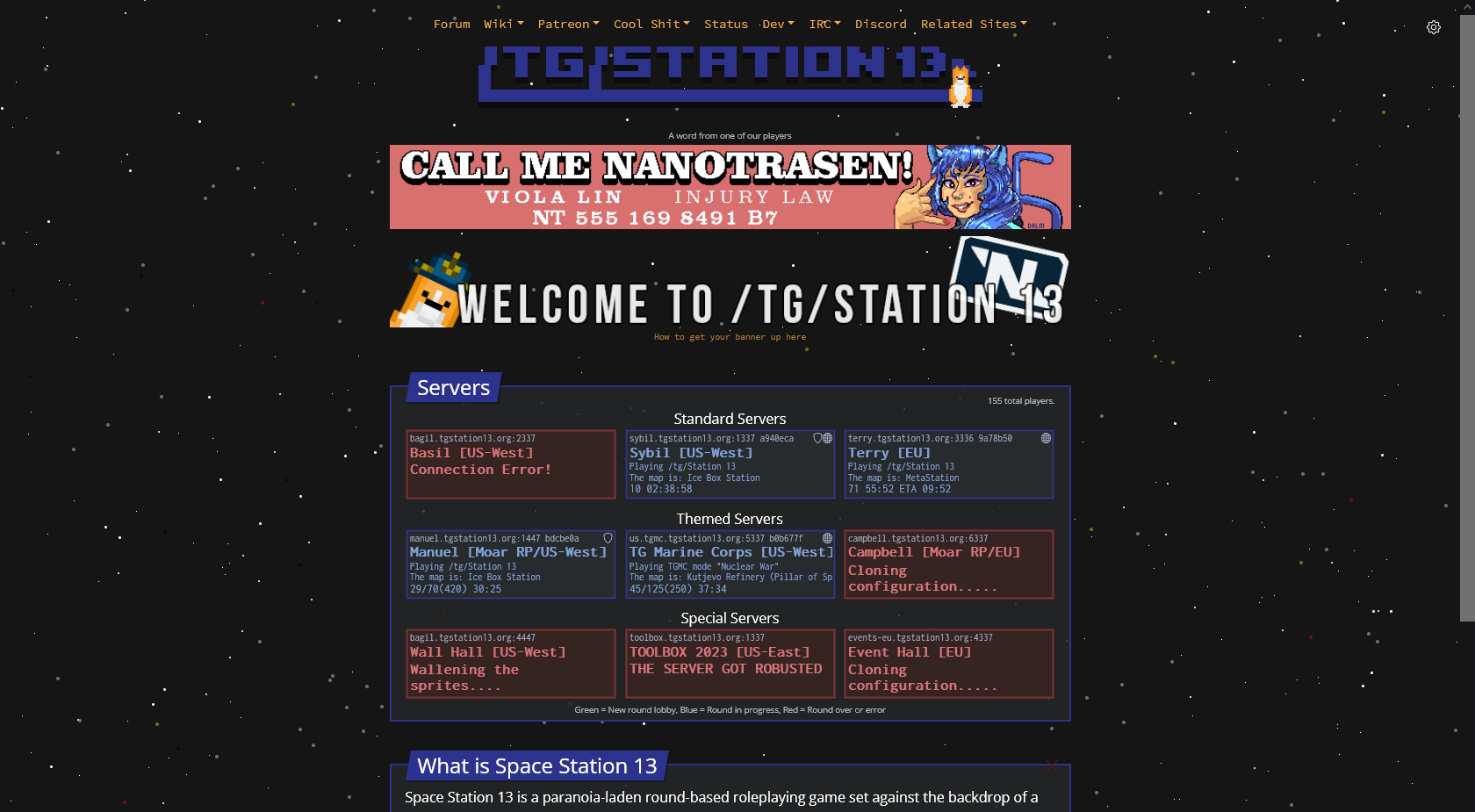
https://mozi-h.de/dev/tgstation-design/
and you can shift click a server to automatically join it when it restarts wtf thats so useful
Re: preview mozi-h's redesign of the tgstation website
Posted: Tue Jul 11, 2023 3:21 pm
by Fikou
it lags my google
Re: preview mozi-h's redesign of the tgstation website
Posted: Tue Jul 11, 2023 5:42 pm
by bobbahbrown
good morning,
why is the PREMIUM banner at bottom?
best wishes,
bobbah 'bee' brown
Re: preview mozi-h's redesign of the tgstation website
Posted: Wed Jul 12, 2023 12:50 am
by warbluke
bobbahbrown wrote: ↑Tue Jul 11, 2023 5:42 pm
good morning,
why is the PREMIUM banner at bottom?
best wishes,
bobbah 'bee' brown
seconded
Re: preview mozi-h's redesign of the tgstation website
Posted: Wed Jul 12, 2023 7:14 am
by kinnebian
but how does it fare with jungle theme
Re: preview mozi-h's redesign of the tgstation website
Posted: Wed Jul 12, 2023 3:43 pm
by Not-Dorsidarf
Doesnt have quick-links to the important guides. That could use fixing. Dont like the low contrast on the game banners.
Re: preview mozi-h's redesign of the tgstation website
Posted: Tue Nov 19, 2024 11:36 pm
by mozi_h
Found this threat by chance. Thanks for the feedback!
Fikou wrote: ↑Tue Jul 11, 2023 3:21 pm
it lags my google
You can change the background or stop the animation in the settings panel (top right

).
bobbahbrown wrote: ↑Tue Jul 11, 2023 5:42 pm
why is the PREMIUM banner at bottom?
Got that comment a lot. I pushed it down because it looks nicer imo. I have bumped it up again and will see what the feedback shows.
Not-Dorsidarf wrote: ↑Wed Jul 12, 2023 3:43 pm
Doesnt have quick-links to the important guides. That could use fixing. Dont like the low contrast on the game banners.
I copied the links from the original site. What do you think is missing? It's not too important as this is easily configurable in the config by the host who is deploying it.
The contrast is a good point. As it uses legacy code from MSO, I'll look into it at a later time.
I am not a big forum user. If you have a GitHub account, please provide feedback at
https://github.com/tgstation/tgstation13.org/pull/72.
Re: preview mozi-h's redesign of the tgstation website
Posted: Wed Nov 20, 2024 12:44 am
by TheSmallBlue
mozi_h wrote: ↑Tue Nov 19, 2024 11:36 pm
Found this threat by chance.
Any threat you find by chance is a bad threat
Re: preview mozi-h's redesign of the tgstation website
Posted: Wed Nov 20, 2024 3:17 am
by zendel8
I see no real difference other than that I have to scroll down to see the servers on smaller window size. This is annoying
Re: preview mozi-h's redesign of the tgstation website
Posted: Sun Dec 01, 2024 11:27 pm
by bingusdingus
It looks nice, but put the server browser at the top, I don't get having to scroll past the banners and alerts, and I could see it getting annoying. I also like the autojoin function. I would also get new screenshots for the "What is Space Station 13" part, no reason to use the outdated ones. Maybe also have the wiki stuff more prominent, I feel like that was one of the things I navigated to that site for the most when I started out.
Re: preview mozi-h's redesign of the tgstation website
Posted: Mon Dec 02, 2024 12:37 pm
by dendydoom
very pretty!
something very sovlful about our current homepage but this one is definitely a massive visual upgrade.
Re: preview mozi-h's redesign of the tgstation website
Posted: Tue Dec 03, 2024 1:37 pm
by mozi_h
zendel8 wrote: ↑Wed Nov 20, 2024 3:17 am
I see no real difference other than that I have to scroll down to see the servers on smaller window size. This is annoying
That's why you can use the red X to close most of the annoying stuff. Most want the banners on top and whilst I think it impedes usability slightly, I must agree that Patreon subscribers should have their banners on top.
bingusdingus wrote: ↑Sun Dec 01, 2024 11:27 pm
It looks nice, but put the server browser at the top, I don't get having to scroll past the banners and alerts, and I could see it getting annoying. I also like the autojoin function. I would also get new screenshots for the "What is Space Station 13" part, no reason to use the outdated ones. Maybe also have the wiki stuff more prominent, I feel like that was one of the things I navigated to that site for the most when I started out.
Again, just close stuff with the red X.
Suggest new images here:
viewtopic.php?f=83&t=37858
The starter guide is more prominently linked in the "into Text" (below the image carousel)
Re: preview mozi-h's redesign of the tgstation website
Posted: Thu Dec 05, 2024 8:56 pm
by oranges
the servers need to be above welcome box.
rule one of web design is the call to action must be visible on the first load of the page above any scroll.
Re: preview mozi-h's redesign of the tgstation website
Posted: Thu Dec 05, 2024 9:18 pm
by mozi_h
oranges wrote: ↑Thu Dec 05, 2024 8:56 pm
the servers need to be above welcome box.
rule one of web design is the call to action must be visible on the first load of the page above any scroll.
Yes, but most feedback (~7 to 1, excluding myself) and patreon dollars say otherwise. So, unless more people agree with us, it'll stay like this.
Or maybe we can ask the banner buyers if they wouldn't mind the banners shifting position?
Otherwise, I wholly agree. It's much, much better UX with banners below. In my PR screenshot you can even see that banners below was the initial intention.
Re: preview mozi-h's redesign of the tgstation website
Posted: Thu Dec 05, 2024 9:51 pm
by TheFinalPotato
why not keep the banners above but drop the "what is space station 13" bit down (in the same format as the current homepage)? was that a stylistic decision or was there more behind it. (or drop the banners to below/frame the join links to bump them up a bit idk)
Re: preview mozi-h's redesign of the tgstation website
Posted: Thu Dec 05, 2024 9:55 pm
by mozi_h
TheFinalPotato wrote: ↑Thu Dec 05, 2024 9:51 pm
why not keep the banners above but drop the "what is space station 13" bit down (in the same format as the current homepage)? was that a stylistic decision or was there more behind it.
It's for the people new to SS13 to get an impression and have the helpful links highlighted (otherwise buried in the navigation).
The returning playerbase will eventually spot the red dismiss cross and use it to bump the servers into better view
Re: preview mozi-h's redesign of the tgstation website
Posted: Thu Dec 05, 2024 10:27 pm
by TheFinalPotato
side note, I had a really hard time finding that, dark red on black is real non ideal
Re: preview mozi-h's redesign of the tgstation website
Posted: Thu Dec 05, 2024 11:35 pm
by oranges
TheFinalPotato wrote: ↑Thu Dec 05, 2024 9:51 pm
why not keep the banners above but drop the "what is space station 13" bit down (in the same format as the current homepage)? was that a stylistic decision or was there more behind it. (or drop the banners to below/frame the join links to bump them up a bit idk)
this is exactly the right answer
Re: preview mozi-h's redesign of the tgstation website
Posted: Fri Dec 06, 2024 12:12 am
by mozi_h
I'm annoyed by forums and getting suggestion all over the place via different channels.
Please post suggestions here, as it belongs there. Thanks.
https://github.com/mozi-h/tgstation13.org/issues
(Otherwise, don't @ me when I don't react to your suggestions)
Re: preview mozi-h's redesign of the tgstation website
Posted: Fri Dec 06, 2024 7:33 pm
by mindstormy
I def agree with oranges that the servers boxes need to be above the fold since they are the most important thing on the page for most visitors. I've been doing web dev for many years and if users have to scroll to do the thing they want to do they are more than likely going to leave the page. Otherwise I do think it looks nice and appreciate the updates.
Re: preview mozi-h's redesign of the tgstation website
Posted: Sun Dec 08, 2024 9:21 pm
by SpaceInaba
honestly i really dont like it, takes away from the utilitarian appeal of the current website while also imo not really looking that much better. do we really need to update the front page at all when it currently looks fine and serves every purpose it needs to? perhaps im just old but it feels like modernizing for the sake of modernizing and nothing else
 ).
).