► Sprite Showcase of WalterJe ◄
Posted: Sat Oct 11, 2014 11:35 pm
Greetings everyone!
My name is Walter and this is obviously, my sprite gallery.
I have been playing SS13 for over a year now, and all the time I thought of improving the station's appearance in various ways.
Half a year ago, I decided to start spriting, so here and now you may enjoy the fruit of my experiments.
I'm keen on the culture of 80's and 90's - I bet you will notice tiny reflections of that too.
Some of the icons shown bellow are probably useless but may serve for entertainment purposes.
In other hand, I would be very glad to see some of those implemented in the game.
Many of those sprites were made exclusively for you folks, because you seem to be open and receptive for new ideas.
► Note! All icons are 32x32px, but the preview might be 64x64px for closer look.
You may also click on some preview images for the reference.
Part 1
As I can't pull out all the icons in one day, I will spare them in parts.
Let's begin from something simple which might have real use on the station.
I remade the firelock so it looks a bit more badass and it has fireproof windows, and you will be sure when it's safe to force open one.
I know that your firelocks are not a full-tile, but still.
One evening I thought: There is a drink vending machines, and there's a Space Cola, but why not have a Space Pepsi?
Well, I guess that stuff on before was not that impressive - it's quite simple, and I admit this. So let's make it more complicated!
Did you know that on Nanotrasen colony planets, citizens safety is granted by Nanotrasen Municipal Security?
Here is one of many service cars from over there: Chevrolet Impala (1971?!)
And another vehicle for you: Cabrio Ferrari Daytona (1968???!!!)
To close up the vehicles parade (I have more, but let's hold them off for later), Motorcycle from Fallout 3|New Vegas!
That's all for today folks!
I have lots of different sprites/icons which I'm going to post on nearest days.
Be prepared for the heavy load of different fluff clothing and stuff.
Also! I'm open for your advices and suggestions, along with your requests!
(I must admit that I complete requests only when I'm in a good mood or like the idea myself, so wish yourself luck.)
Part 2
Hello there! I am back, bringing more original stuff for you folks!
I guess today we better begin with all the requests and suggestions you made!
Request #1
There is nothing I can change about current tables - they are just fine, and combine with new chairs pretty well (even if Miggles or someone else think otherwise).
But I didn't want to disappoint the fella who made the original and interesting request, so I thought: if you can't change anything - just add something new.
So here you get classy glass tables!
Done with tables. Let's get back to dem new chairs.
On the first day when I created the thread, thanks to Saegrimr, great part of community was able to see my sprites in action on Sybil (with 84 players observing this).
And while consoles have quite reasonable arguments for not being replaced with new ones, chairs got a really controversial reception.
This is just a tiny chat log from #tgstation13, the names were altered not to abuse anyone:
I got used to that classic old grey rickety myself, but why not make station look generally better?
As I told before - I'm open to advices an suggestions, and based on this, I decided to improve my chair icon even more!
Request #2
Meet updated new chair + electric modification!
DISCLAIMER! The following console sprites are based of icon from THIS THREAD.
I was amazed by the general design of the engine, but what took my attention even more - was the console.
And I took the base from the one presented in thread, so all the credit goes to the original creator.
But what I did here myself exactly - the animations and all icons needed for replacing all of the station consoles with these.
► Note! Wasn't this stuff in this thread on before?
Yes it was, but I have finished the rest of consoles but Telecommsat controls, and added more neat things.
See the spoiler for new icons, and download the updated pack!
While ago, Nienhaus has sprited the backpacks.
Now it's my turn to try fate with these. Meet modern backpacks!
One of many things that I sprite, and probably the most favorite of mine, is a fluff clothing.
I will share a lot of it with you later, but today I want to introduce you The Postal Dude outfit!
The following sprite is based on my music taste, so I'm apt to share it.
I'm keen on synth-pop, electronics, classic rock, pop rock of 70's and 80's, hard rock and many other genres.
This sprite is a tribute to Fatboy Slim I love listen to so much.
It was very nice here today, but it's time to close up the Part 2!
I've seen how much you liked the vehicles I made, also many suggestions were on how perfect they would fit into the away missions.
Specially for away missions or events...
I'm proud to present...
Wunderwaffe Watler (it's not a typo) M1A1 based, Heavy Artillery Hovertank!
Thanks and good luck, see you next time!
Part 3
Hello world! Long time no see!
Once again, I am bringing exclusive fun stuff, especially for you.
First of all, thank you for all the comments you wrote - it serves an a good motivation for me to keep working on my style and create more stuff.
Also special thanks to Paprika for implementing amazing modular system for table construction and adding glass tables with full functionality just as I have described it on before!
His pull request is already on GitHub, waiting for it's turn to get merged right here.
I can't wait to try it on practice, pretty sure it will add some neat variety for the gameplay.
Let's get back to my sprites now!
Meet MTV AI!
Back in 2011, there was a Warhammer Chainsword in SS13. It got removed year or year and a half later.
Here is a basic alternative to it: Chainsaw!
Now it might get slightly embarrassing, but hey - I'm just having fun!
I love Postal series, and I couldn't stop myself from adding Krotchy stuff to my personal build of TG station.
Here is the "Bad Touch" Krotchy Doll!
And here we have a Krotchy suit!
I guess we shall continue with some badass clothing.
Meet Red Faction mining rig suit!
One of my friends is a big fan of Serenity, and the Firefly series in general.
He found an icon called "captain_fly" in the current Baystation build, that's currently unused.
It's surely a reference to Captain Malcolm Reynolds, but the realization of the icon is frankly awful (see for yourself if you want).
The one on Baystation is a classic outfit from Firefly series, but I like Serenity variant a bit more.
So here is properly done, the Captain Tight Pants suit!
I kept the most ultimate and the most probable part to be applied to TG station, for the last moment!
I'm sure you have already got bored of insipid white, grey and black undershirts.
Welcome my "Young Folks ®" undershirt + jeans & pants pack!
And now, the biggest and the most complicated part for today, and maybe for all the time since I have been posting here:
Great Soghun/Unathi Overhaul
This one is going to be pretty long one, full details are under the spoiler.
The point is - the only generally accessible humanoid alien species here on TG, is a reptile which has different naming from one server to another.
Another question is, what does it look like? Like a green (or name your favorite color) human with a tail and spikes?
Unfortunately, this lizard stuff found out to be too "controversial" to ever make it to the game. Most people were outraged by the need of creating additional sprites in case new clothing is added in the build, but they didn't think that actually there is no need to do so - as lizardmen are bigger than humans, all the additional clothing will just tear apart on them, or just don't fit at all, and it's easily supported by game mechanics. Just in case spriters want to try make their own outfits for Soghun/Unathi based on human ones - they just need to edit a few pixels on each side, which is fast and easy even for beginners. I wish some people were not that strict in conclusions or conservative, but it's not for me to judge.
Part 3, out.
Part 4
Greetings friends! It has been quite a while since I posted anything. The good news is - I'm back in action, and have some good tricks up my sleeve!
It's awesome to see my glass tables and undershirts in-game. I'm very grateful for any support you give me!
That gives me confidence, that despite controversy towards some of my stuff, I still have a good chances to affect the game in the best way possible.
Allright, let's get back to our main topic.
As you already know, I like editing and improving already existing things, just because their look is rough and outdated.
Mostly it's not excused by statement that "The game Universe is low-tec!". Look around, nowadays some simple things may look rather futuristic.
This is just another case of such a remake, Genetics of XXVI 26th century!
When genetics may seem too futuristic for some of you, let's go another way and make something realistic!
Have you ever seen PDA in real life? Just Google it yourself or simply click here.
The following design doesn't go ahead of time (more like Acer N30 or HP iPAQ RX1950), suitable for "low-tec" game Universe.
Behold PDA and cartridge pack in it's glory!
Let's keep going with realistic designs. Meet Game Boy inspired pAI!
Doesn't it irritate you, when you have to pull/grab an animal and get it through the station? The critter escapes every 15 seconds and drives you crazy!
I have found easy and logical solution, and it's better than locking lil' critter into a closet. Meet Conventional Pet Carrier!
Why does station bounced radio/walkie-talkie look like somewhat green, 1985 cell phone? Here is up-to-date walkie-talkie!
Why does syndicate uplink look like radio receiver? Here, have this 1985 cell phone!
Previous one was more like a joke, there is no need to throw rotten tomatoes at me.
I just want to make it clear that the following sprite is 100% serious.
Meet replacement for standard security conducted electrical weapon: X26 taser!
Do you love cool guns? Awesome! Do you love cool guns in anime? This Heavy Laser Rifle from Akira is just perfect for you!
Put on your animal head mask and grab this Hotline Miami melee weapons pack!
We already have a baseball bat on above, why not have baseball glove and ball?
God save The Queen! Head of Security definitely needs this Queen's Guard hat!
I really love to draw vehicles, but I didn't post any in the previous update.
So here is another neat thing from United Kingdom: Combat Vehicle Reconnaissance (Tracked)
Have you ever been to New Eden's Colonial Marines? I blame them for making original server with no original content.
Aliens (1986) film is one of my favorites, mostly for epically perfect moments like this!
Enjoy my United States Colonial Marine Corps pack!
I moved it from Part 1, because every marine needs a proper gun.
Meet my best friend here: air-cooled, selective fire, the M41A Pulse Rifle!
Soldier, you are almost ready to go and hunt down some xenos!
The only other thing which can save your life (or not) is this top notch Motion Tracker!
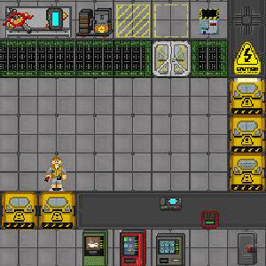
Bonus screenshot of Colonial Marines on combat drop!
Afterword:
I know that it's really hard to change something basic or common in the SS13, specially when everyone already got used to it.
Even changing the simple chairs appeared to be a problem.
It's all the conservative views of people around us, and that's just human nature, I don't blame anyone for this.
You know that many famous scientists had a hard time proving their point.
Because we all love the stars and space itself here, I must say that Copernicus and Galilei had extreme opposition going against their astronomical research.
Even despite the things they were trying to prove, sound simple and understandable for us, like that the Earth is an oblate spheroid (simply saying - a sphere),
and orbiting the Sun - both scientists and church were trying to prove them wrong.
But now we know that it's all true, and nothing can change this truth. You know, a real science.
Or something more common for us, like music: when Jimi Hendrix played his blues and rocked the soul out of himself,
people thought it was awful, because it wasn't the same with classics - neither classic blues, nor rock'n'roll.
But now we know that Hendrix is great, and nothing will change this as well. Actually many musicians,
especially those who had a progressive style for the time, had this problem.
This explains why a lot great people became famous only after their death - just because the crowd needed a lot of time to embrace new ideas they were bringing.
I'm not trying to prove that the Earth is flat, or that the grass is red and the fire is actually cold.
I just want to make my favorite game better, and to improve it not only for myself, but also for everyone who might play it, so it brings more fun and possibilities.
I'm not trying to prove that everything I make is great, perfect or anyway needs to be in the game. But I'm asking you to think not for yourself when you are trying to unreasonably oppose my proposals, but for the all community, and maybe not the only /tg/ but the rest of it, all over the world.
Anyone can point a finger and say: "Damn son, it's shit.", but here on the forums, it sounds more like: "It doesn't fit in, it looks so ugly and awful!"
From all the honesty of my heart, I'm not upset or angry at the people who did post negative stuff on what I create, in this thread or elsewhere.
Also there were a lot of reasonable arguments, which I accept and totally agree with.
As you can see - I actually did listen to your critique even when it wasn't what I wanted to hear.
I tried to improve things, and I think the final product looks great.
I'm asking all of you once again - don't just think about yourself, but think about all your friends in the community.
Maybe they will appreciate stuff more than you do, and the best thing you will ever see - would be smiles on their faces.
Open your heart, be kind and reasonable - so that one pleasant day, we can make our world a better place.
If you were patient to read all that and get the understanding - you are glorious!
Stay classy!
My name is Walter and this is obviously, my sprite gallery.
I have been playing SS13 for over a year now, and all the time I thought of improving the station's appearance in various ways.
Half a year ago, I decided to start spriting, so here and now you may enjoy the fruit of my experiments.
I'm keen on the culture of 80's and 90's - I bet you will notice tiny reflections of that too.
Some of the icons shown bellow are probably useless but may serve for entertainment purposes.
In other hand, I would be very glad to see some of those implemented in the game.
Many of those sprites were made exclusively for you folks, because you seem to be open and receptive for new ideas.
► Note! All icons are 32x32px, but the preview might be 64x64px for closer look.
You may also click on some preview images for the reference.
Part 1
As I can't pull out all the icons in one day, I will spare them in parts.
Let's begin from something simple which might have real use on the station.
I remade the firelock so it looks a bit more badass and it has fireproof windows, and you will be sure when it's safe to force open one.
I know that your firelocks are not a full-tile, but still.
Spoiler:

Spoiler:


Did you know that on Nanotrasen colony planets, citizens safety is granted by Nanotrasen Municipal Security?
Here is one of many service cars from over there: Chevrolet Impala (1971?!)
Spoiler:
Spoiler:
Spoiler:
I have lots of different sprites/icons which I'm going to post on nearest days.
Be prepared for the heavy load of different fluff clothing and stuff.
Also! I'm open for your advices and suggestions, along with your requests!
(I must admit that I complete requests only when I'm in a good mood or like the idea myself, so wish yourself luck.)
Part 2
Hello there! I am back, bringing more original stuff for you folks!
I guess today we better begin with all the requests and suggestions you made!
Request #1
I thought about this issue for quite some time, and decided that...miggles wrote:those new chairs are amazing though. do you think you could touch up tables too?
There is nothing I can change about current tables - they are just fine, and combine with new chairs pretty well (even if Miggles or someone else think otherwise).
But I didn't want to disappoint the fella who made the original and interesting request, so I thought: if you can't change anything - just add something new.
So here you get classy glass tables!
Spoiler:


On the first day when I created the thread, thanks to Saegrimr, great part of community was able to see my sprites in action on Sybil (with 84 players observing this).
And while consoles have quite reasonable arguments for not being replaced with new ones, chairs got a really controversial reception.
This is just a tiny chat log from #tgstation13, the names were altered not to abuse anyone:
Spoiler:
As I told before - I'm open to advices an suggestions, and based on this, I decided to improve my chair icon even more!
Request #2
Done and done!Jordie0608 wrote: With the chairs, do you think you'd be able to create an electric chair version with some wiring and a helmet on it?
Meet updated new chair + electric modification!
Spoiler:


I was amazed by the general design of the engine, but what took my attention even more - was the console.
And I took the base from the one presented in thread, so all the credit goes to the original creator.
But what I did here myself exactly - the animations and all icons needed for replacing all of the station consoles with these.
► Note! Wasn't this stuff in this thread on before?
Yes it was, but I have finished the rest of consoles but Telecommsat controls, and added more neat things.
See the spoiler for new icons, and download the updated pack!
Spoiler:


Now it's my turn to try fate with these. Meet modern backpacks!
Spoiler:


I will share a lot of it with you later, but today I want to introduce you The Postal Dude outfit!
Spoiler:

I'm keen on synth-pop, electronics, classic rock, pop rock of 70's and 80's, hard rock and many other genres.
This sprite is a tribute to Fatboy Slim I love listen to so much.
Spoiler:
I've seen how much you liked the vehicles I made, also many suggestions were on how perfect they would fit into the away missions.
Specially for away missions or events...
I'm proud to present...
Wunderwaffe Watler (it's not a typo) M1A1 based, Heavy Artillery Hovertank!
Spoiler:

Part 3
Hello world! Long time no see!
Once again, I am bringing exclusive fun stuff, especially for you.
First of all, thank you for all the comments you wrote - it serves an a good motivation for me to keep working on my style and create more stuff.
Also special thanks to Paprika for implementing amazing modular system for table construction and adding glass tables with full functionality just as I have described it on before!
His pull request is already on GitHub, waiting for it's turn to get merged right here.
I can't wait to try it on practice, pretty sure it will add some neat variety for the gameplay.
Let's get back to my sprites now!
Meet MTV AI!
Spoiler:
Here is a basic alternative to it: Chainsaw!
Spoiler:
I love Postal series, and I couldn't stop myself from adding Krotchy stuff to my personal build of TG station.
Here is the "Bad Touch" Krotchy Doll!
Spoiler:
Spoiler:
Meet Red Faction mining rig suit!
Spoiler:
He found an icon called "captain_fly" in the current Baystation build, that's currently unused.
It's surely a reference to Captain Malcolm Reynolds, but the realization of the icon is frankly awful (see for yourself if you want).
The one on Baystation is a classic outfit from Firefly series, but I like Serenity variant a bit more.
So here is properly done, the Captain Tight Pants suit!
Spoiler:
I'm sure you have already got bored of insipid white, grey and black undershirts.
Welcome my "Young Folks ®" undershirt + jeans & pants pack!
Spoiler:


Great Soghun/Unathi Overhaul
This one is going to be pretty long one, full details are under the spoiler.
The point is - the only generally accessible humanoid alien species here on TG, is a reptile which has different naming from one server to another.
Another question is, what does it look like? Like a green (or name your favorite color) human with a tail and spikes?
Spoiler:


Part 3, out.
Part 4
Greetings friends! It has been quite a while since I posted anything. The good news is - I'm back in action, and have some good tricks up my sleeve!
It's awesome to see my glass tables and undershirts in-game. I'm very grateful for any support you give me!
That gives me confidence, that despite controversy towards some of my stuff, I still have a good chances to affect the game in the best way possible.
Allright, let's get back to our main topic.
As you already know, I like editing and improving already existing things, just because their look is rough and outdated.
Mostly it's not excused by statement that "The game Universe is low-tec!". Look around, nowadays some simple things may look rather futuristic.
This is just another case of such a remake, Genetics of XXVI 26th century!
Spoiler:


Have you ever seen PDA in real life? Just Google it yourself or simply click here.
The following design doesn't go ahead of time (more like Acer N30 or HP iPAQ RX1950), suitable for "low-tec" game Universe.
Behold PDA and cartridge pack in it's glory!
Spoiler:


Spoiler:


I have found easy and logical solution, and it's better than locking lil' critter into a closet. Meet Conventional Pet Carrier!
Spoiler:
Spoiler:
Spoiler:
I just want to make it clear that the following sprite is 100% serious.
Meet replacement for standard security conducted electrical weapon: X26 taser!
Spoiler:
Spoiler:
Spoiler:
Spoiler:
Spoiler:


So here is another neat thing from United Kingdom: Combat Vehicle Reconnaissance (Tracked)
Spoiler:
Aliens (1986) film is one of my favorites, mostly for epically perfect moments like this!
Enjoy my United States Colonial Marine Corps pack!
Spoiler:
Meet my best friend here: air-cooled, selective fire, the M41A Pulse Rifle!
Spoiler:
The only other thing which can save your life (or not) is this top notch Motion Tracker!
Spoiler:


Spoiler:
I know that it's really hard to change something basic or common in the SS13, specially when everyone already got used to it.
Even changing the simple chairs appeared to be a problem.
It's all the conservative views of people around us, and that's just human nature, I don't blame anyone for this.
You know that many famous scientists had a hard time proving their point.
Because we all love the stars and space itself here, I must say that Copernicus and Galilei had extreme opposition going against their astronomical research.
Even despite the things they were trying to prove, sound simple and understandable for us, like that the Earth is an oblate spheroid (simply saying - a sphere),
and orbiting the Sun - both scientists and church were trying to prove them wrong.
But now we know that it's all true, and nothing can change this truth. You know, a real science.
Or something more common for us, like music: when Jimi Hendrix played his blues and rocked the soul out of himself,
people thought it was awful, because it wasn't the same with classics - neither classic blues, nor rock'n'roll.
But now we know that Hendrix is great, and nothing will change this as well. Actually many musicians,
especially those who had a progressive style for the time, had this problem.
This explains why a lot great people became famous only after their death - just because the crowd needed a lot of time to embrace new ideas they were bringing.
I'm not trying to prove that the Earth is flat, or that the grass is red and the fire is actually cold.
I just want to make my favorite game better, and to improve it not only for myself, but also for everyone who might play it, so it brings more fun and possibilities.
I'm not trying to prove that everything I make is great, perfect or anyway needs to be in the game. But I'm asking you to think not for yourself when you are trying to unreasonably oppose my proposals, but for the all community, and maybe not the only /tg/ but the rest of it, all over the world.
Anyone can point a finger and say: "Damn son, it's shit.", but here on the forums, it sounds more like: "It doesn't fit in, it looks so ugly and awful!"
From all the honesty of my heart, I'm not upset or angry at the people who did post negative stuff on what I create, in this thread or elsewhere.
Also there were a lot of reasonable arguments, which I accept and totally agree with.
As you can see - I actually did listen to your critique even when it wasn't what I wanted to hear.
I tried to improve things, and I think the final product looks great.
I'm asking all of you once again - don't just think about yourself, but think about all your friends in the community.
Maybe they will appreciate stuff more than you do, and the best thing you will ever see - would be smiles on their faces.
Open your heart, be kind and reasonable - so that one pleasant day, we can make our world a better place.
If you were patient to read all that and get the understanding - you are glorious!
Stay classy!
